Redesign of Fitbit Help
Redesign of Fitbit customer support to encourage users to use the self-service platform instead of calling.
At a glance
- Company
Fitbit
2017
- Role
UX Design Lead
- Team
Worked directly with three stakeholders and a program manager.
- Responsibilities
UX Design, research synthesis, framework, and vision.
- Goal
Help customers find answers on help.fitbit.com instead of calling Fitbit, giving them a better experience while reducing the number of calls to the call center.
- Outcome
A mobile-first, responsive help site built on a new, metrics-driven navigation system, documented in scenario flows and a system map. The Help team and extended stakeholders received it well, but the CMS upgrade was put on hold and the redesign did not move forward.
Design a vision for help.fitbit.com as a self-service platform that reduces incoming help calls. I bridged customer support and product design and began collaborating with the onboarding team. I met with Stakeholders, drew a service blueprint, conducted a site audit, and proposed a new, metrics-based navigation approach.
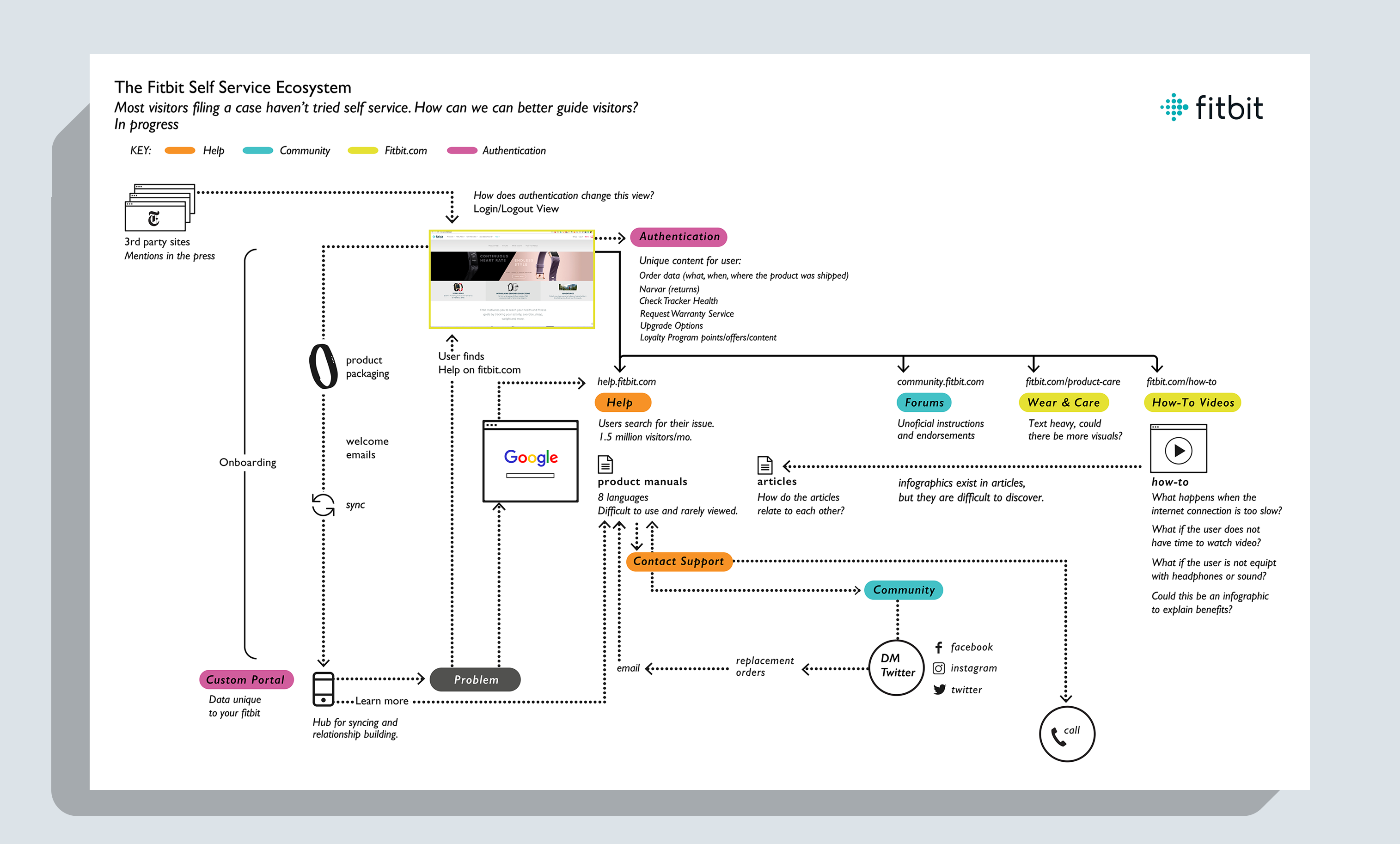
How might we create a self-service platform?
The Fitbit support site drew about 1.5 million visitors a month, most of them searching for answers to specific issues, but most visitors who filed a support case had never tried self-service. We believed that if people could find help on the website, fewer of them would need to call Fitbit. I had to rethink the entire site's navigation.
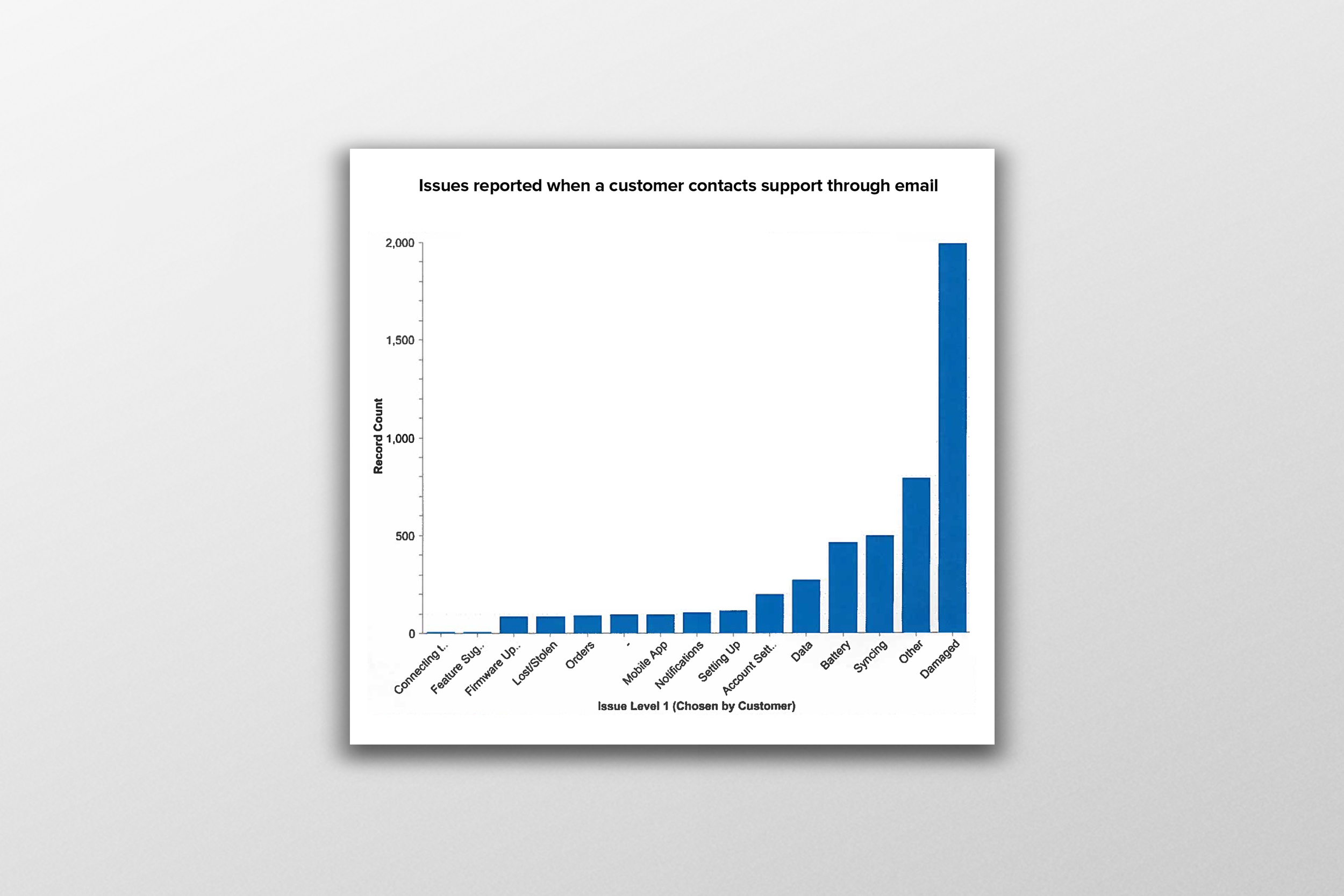
Let the metrics show what customers need
Fitbit had a mature product design team, yet the customer service lacked a design presence. I consulted with three stakeholders from the User Authentication, Community Forum, and Help teams, each with a very different view of what to prioritize. To align them, I mapped the user journey of how customers reached help. The map unified our efforts and clarified requirements for the first design phase.
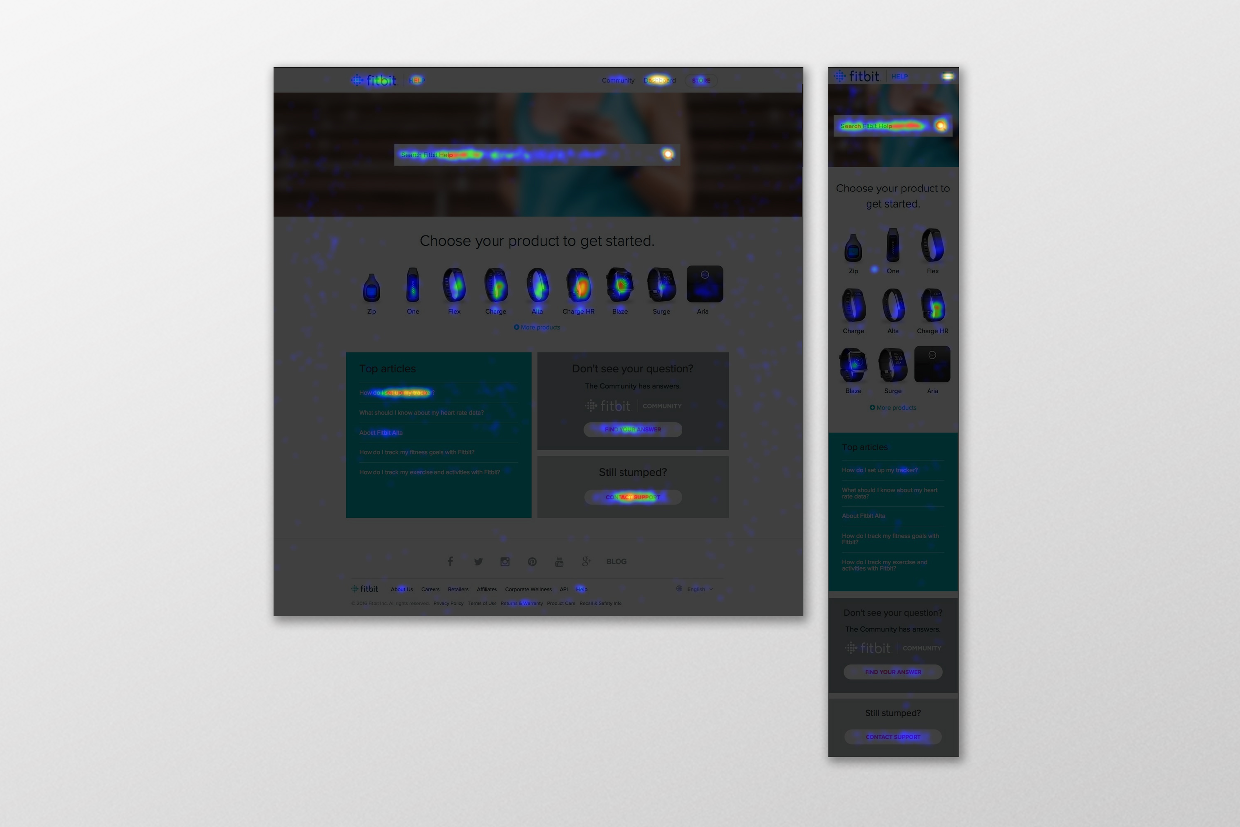
Finding order in the research
On the existing platform, customers who couldn't find an answer had to complete a multi-step questionnaire before they could call for help. My goal was to get them to the right article before that point. How might we help customers narrow their search quickly, without contacting support? Fitbit had a large amount of quantitative data on how people used the site, so the research started there: support email data, site analytics, and heatmaps.
Bridging customer support and product design
To make sense of the data, I took over an underused conference room and brought all the pieces together in one place to track the elements I was working with: existing research, over 200 articles, and personas. After identifying the key pain points in the current experience, I quickly sketched new ways to access articles (regrouping 17 categories into 4), identify a tracker, search, and reach the community. After the first month, I joined forces with the Product Team for feedback. The critique sessions bridged gaps between teams and improved relationships, and the cross-team meetings continued beyond this effort.
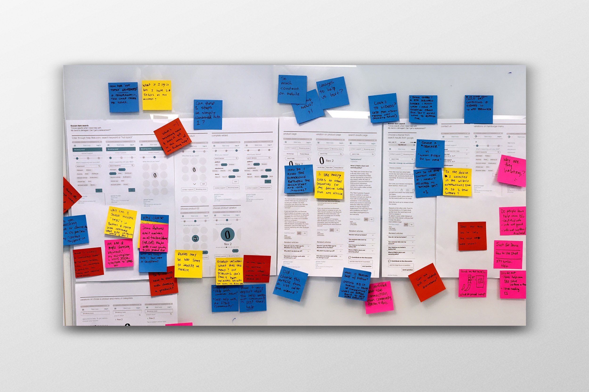
Designing mobile first
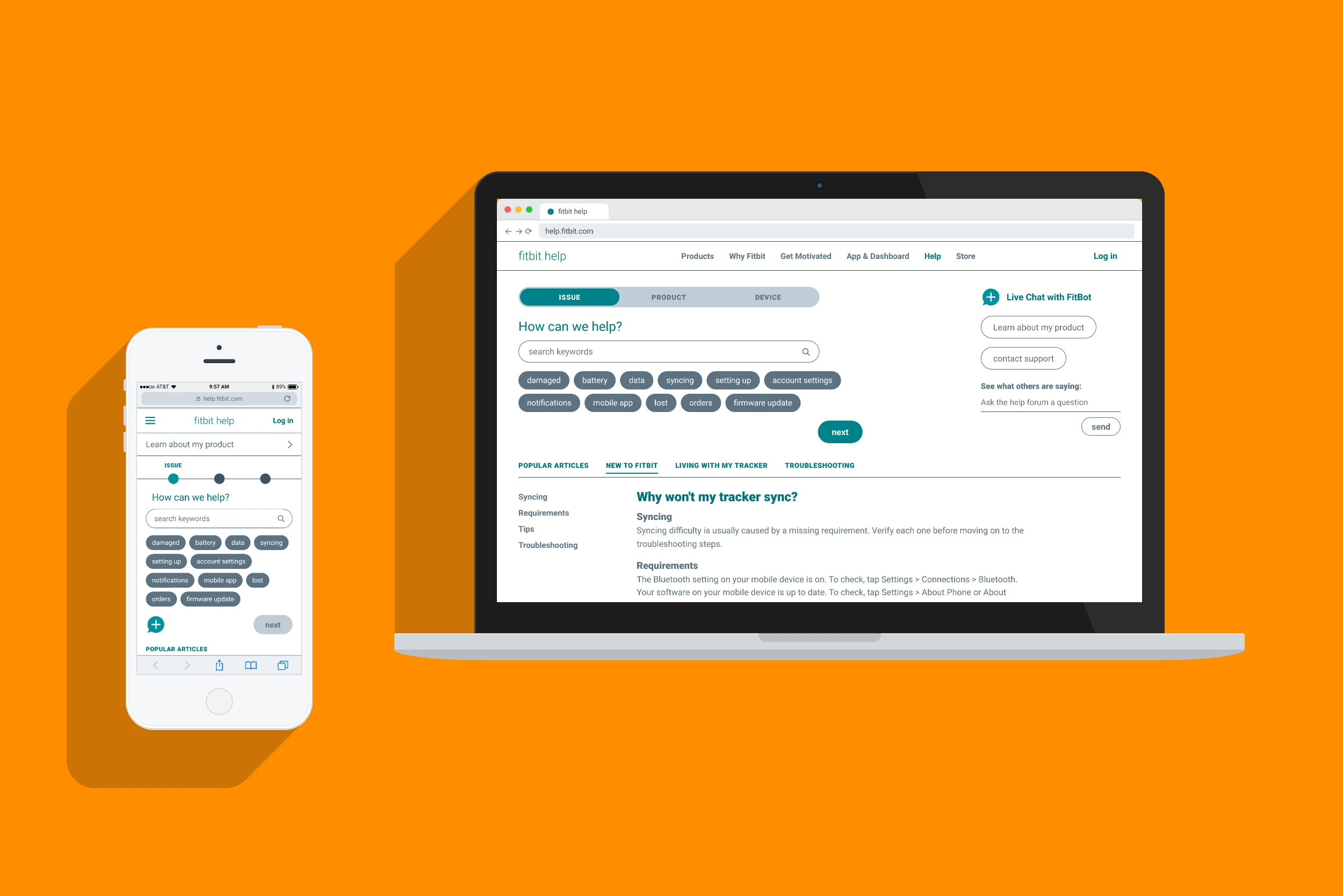
Metrics showed that most people accessed help from their phones while on the go, so I took a mobile-first approach and then designed the desktop experience as well. The new navigation starts with the customer's issue, then their product and device, with search, live chat, popular articles, and the community forum always close at hand.
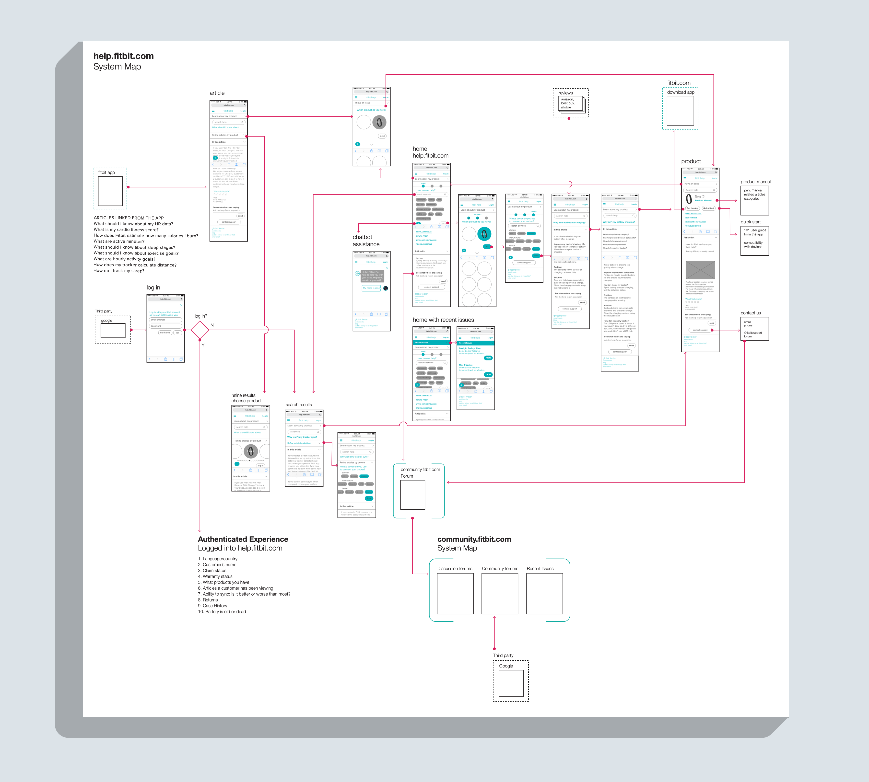
A system map
The new designs and overall user experience were well received by the Help team and the extended stakeholders. I captured the artifacts in a presentation for the team. In the end, due to competing priorities, Fitbit put the CMS upgrade initiative on hold, and the project did not move forward. Two years later, Google acquired Fitbit.
What carried forward
Although the redesign did not ship, a few things outlasted it. Mapping the customer journey gave three teams with competing priorities a shared picture to work from. Reaching out to the product team also started cross-team meetings with product onboarding that continued long after this project ended.