Chart Accessibility for Workday
Providing accessibility to Workday's charts.
At a glance
- Company
Workday
2018
- Role
UI Designer
- Team
A charting developer and the design systems team.
- Responsibilities
Visual design, research, exploration, prototyping, and recommendations.
- Goal
Design a pattern library to support people with color blindness.
- Outcome
A pattern system built from basic elements, tuned for density in small spaces. I met accessibility standards by interpolating colors to meet contrast levels.
When I joined the company, Workday Analytics was replacing the current visualization library with one that could handle larger volumes of data. Over two months, I audited the current framework, conceptualized a pattern-based approach, executed the designs, and tested the patterns internally. Accessibility is ethically the right thing to do. I was thrilled to have the opportunity to contribute to this feature.
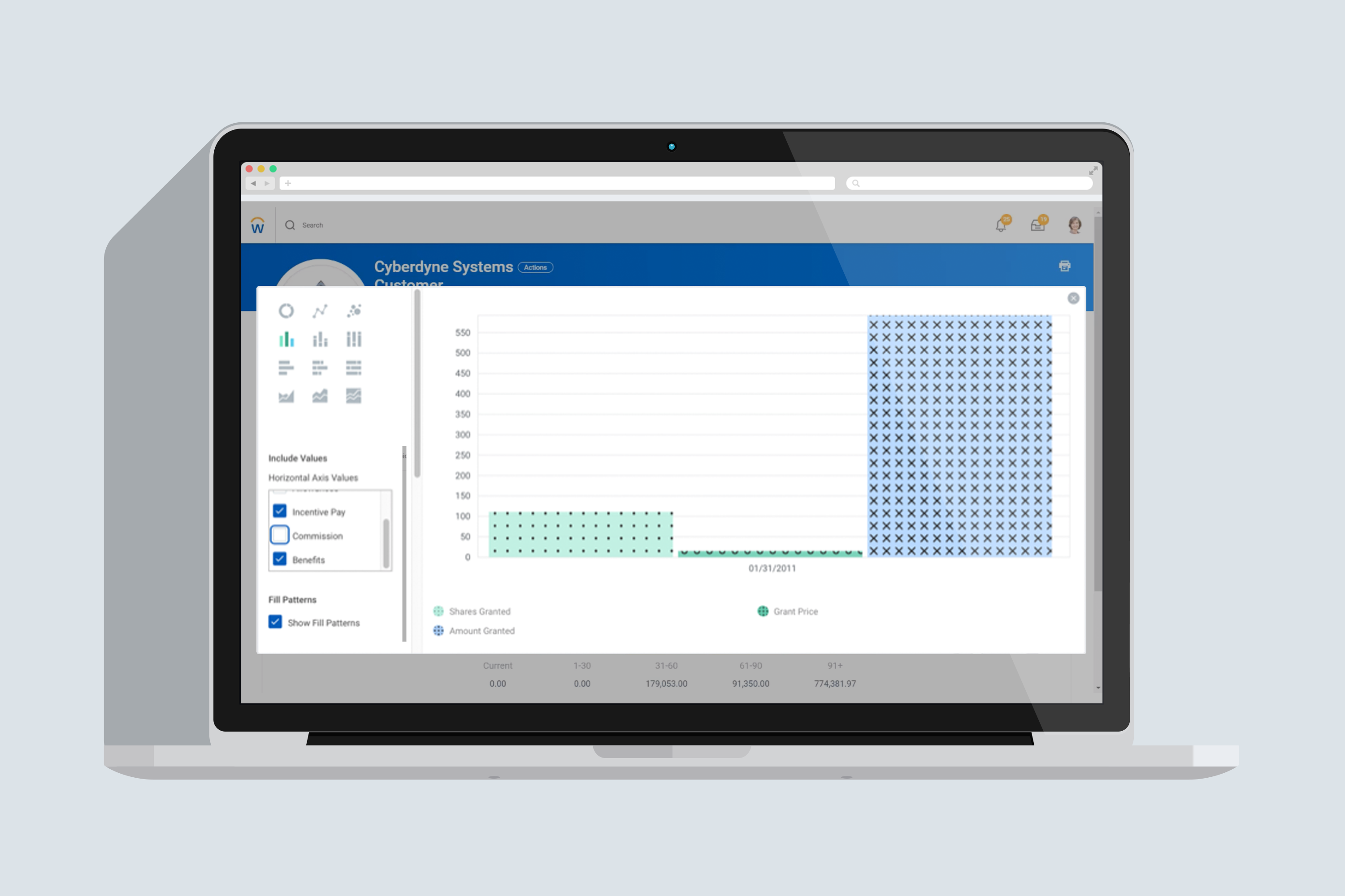
Understanding the Context
When I began this project, I researched whether the current patterns followed any logic. They did not match the system colors and were hard to read at small sizes; the charting library did not offer any guidance. I learned it was a neglected part of the design system, and I embraced the challenge.
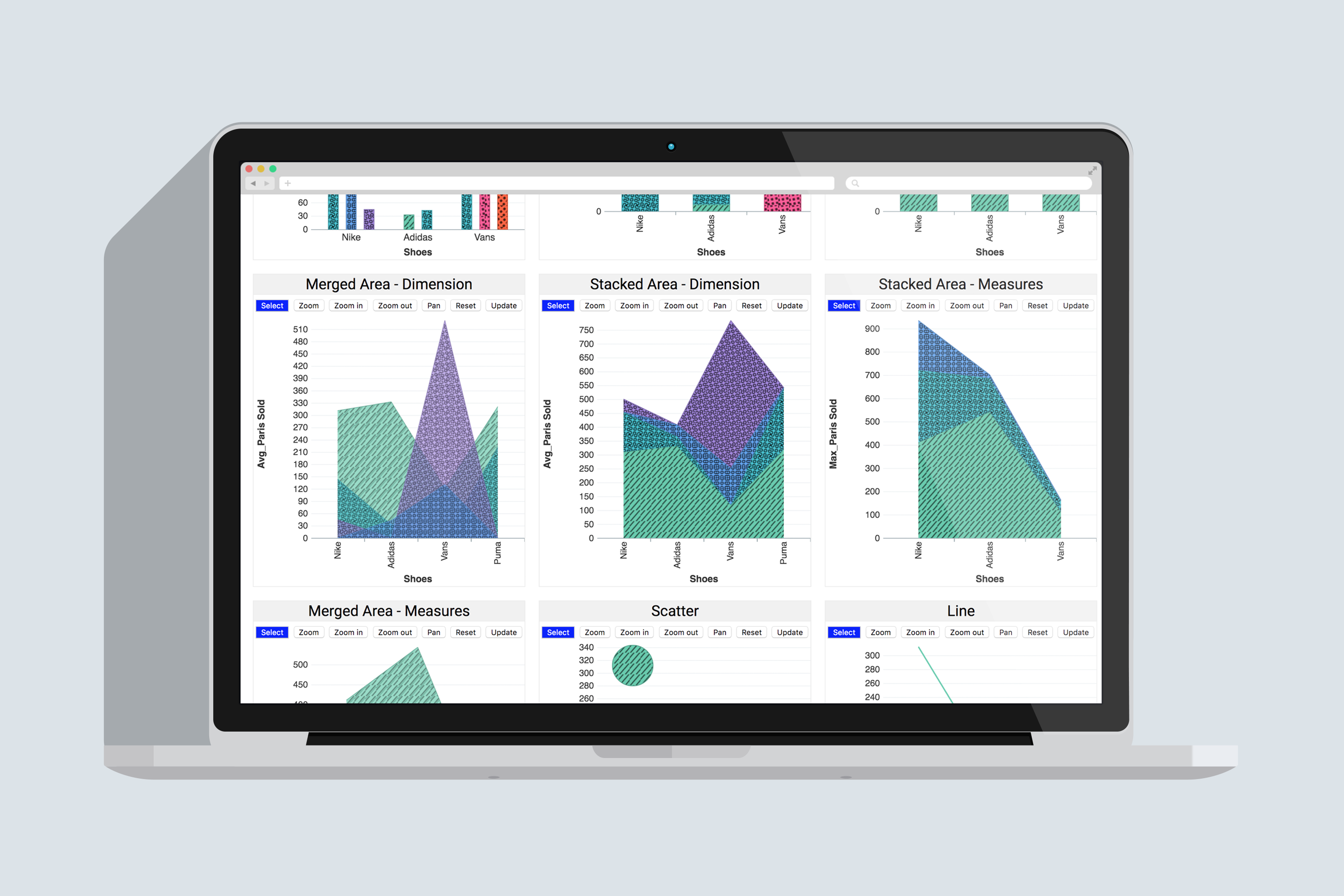
Define Logic to Display the Patterns
The developer needed guidance on a way to implement patterns. He played with random colors and shapes to test the functionality, but it was lacking cohesiveness with the Workday platform.
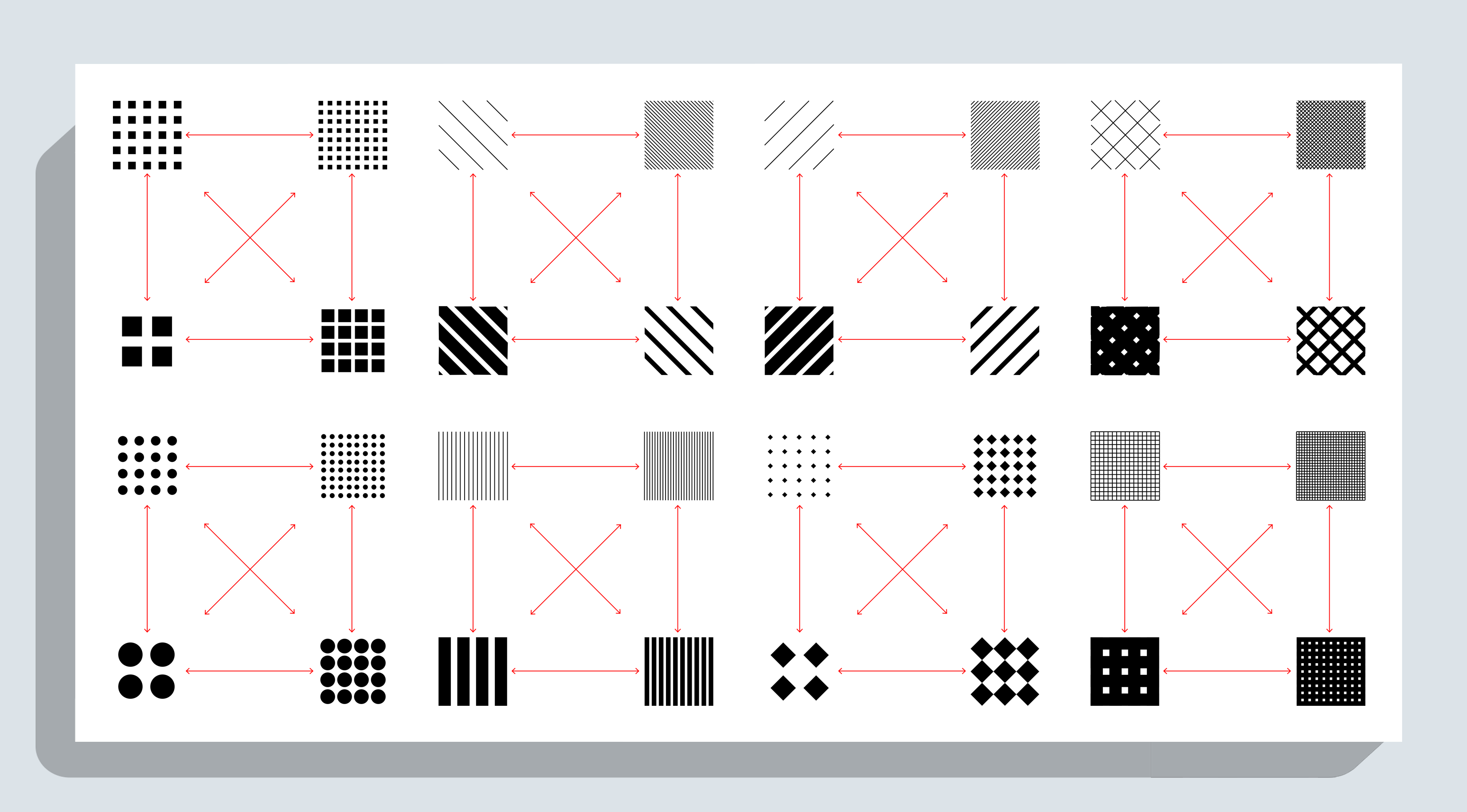
Exploring Spacial Density
After selecting basic elements, I explored options ranging from sparse to dense patterns. After selecting patterns, I began incorporating colors from the design system.
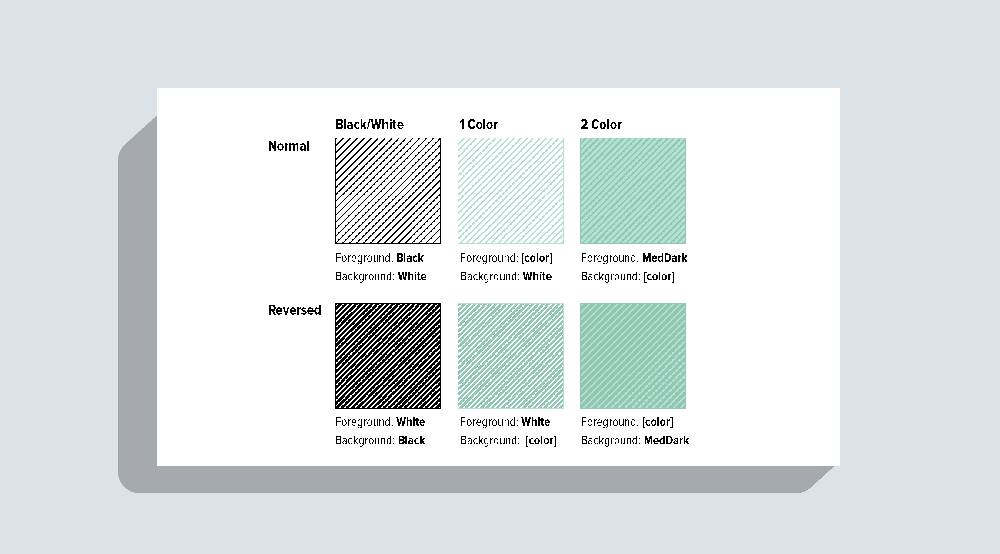
Challenges
This was new territory, and I developed a process for designing patterns on my own and proposing them to my team. I looked at the foreground and background to examine which contrast would be the most legible.
.png)
Close Collaboration with Development
I worked with a codepen that the developer created to help me formulate the color patterns.
Outcome
Based on legibility standards, I used color interpolation to blend between the two values. This produced a set of high-contrast color and fill pattern pairs. This project created positive business value by incorporating accessibility and consistency into Workday's charting library. I created logic for how the patterns were displayed and connected it to the design system's colors.
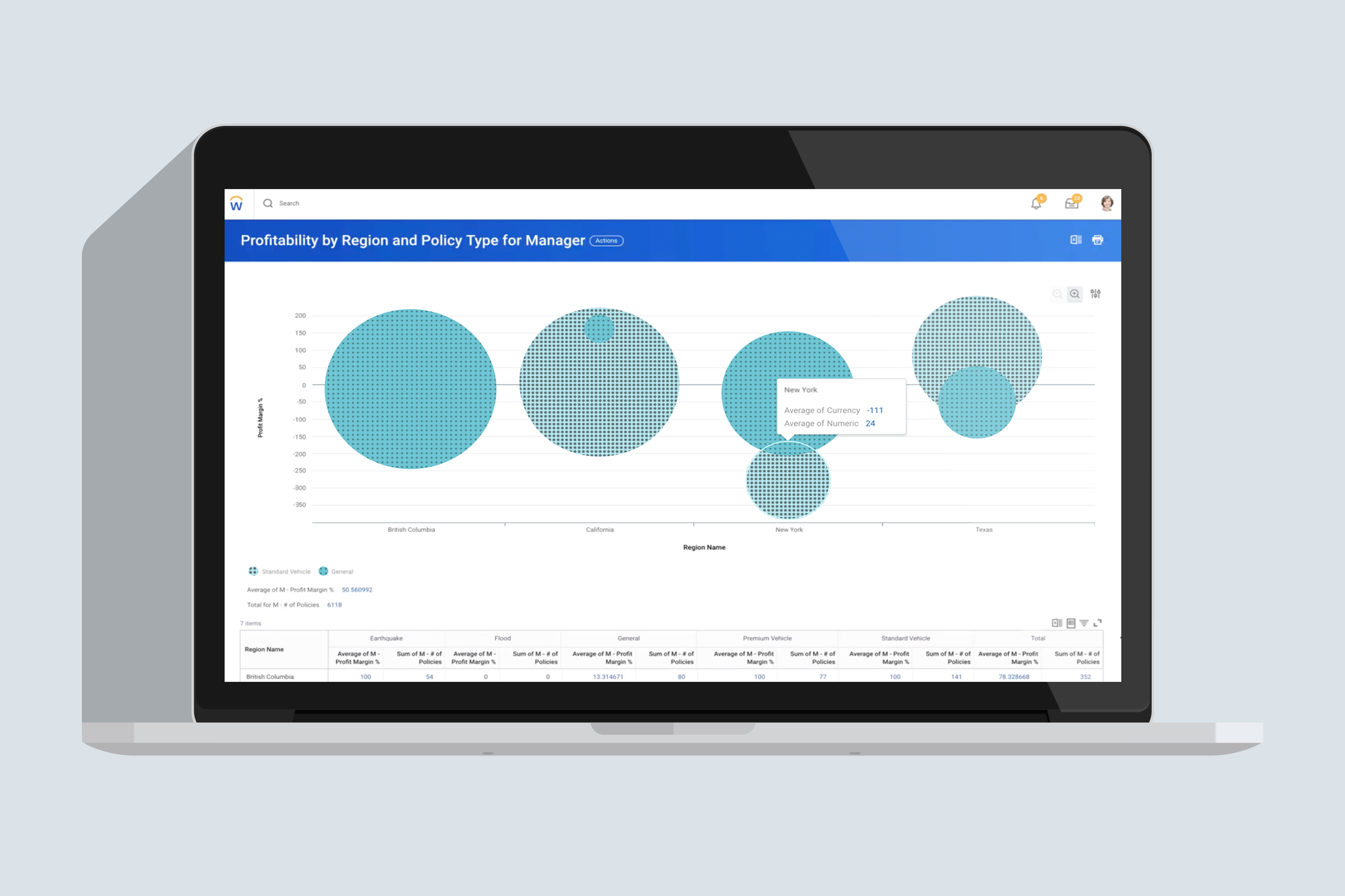
Accessible Patterns Shipped in the Workday Platform
The new color schemes and fill patterns significantly improved accessibility across the platform, making it easier for a wider range of individuals to navigate and interact with charts in the Workday enterprise. Patterns shipped, complied with usability/contrast standards, and were incorporated into the design system. The project was well received and improved accessibility across the platform.