Google Express
Design the shopping experience journey and wireframes to build the Google Shopping Express Android app.
At a glance
- Company
Google/Fluid Agency
April 2013
- Role
UX Designer
- Team
Met with the Google Shopping team and worked with Fluid (agency) designers.
- Responsibilities
Created several screens to display shopping categories, view the cart, add a category, checkout, remove from checkout, change quantity, shop a different store, and consolidate delivery.
- Goal
Create an Android app that displays several aspects of the Google Shopping Express shopping experience.
- Outcome
Document the ecosystem of the product and its various touchpoints along desktop and mobile platforms.
Google announced the transition from the old Google Shopping to Google Express in 2013, an evolved version of the platform that lets users buy products from different vendor websites & marketplaces directly on Google Express. Our team consulted with Google to propose a solution that would handle everything on its platform, from collecting payments to delivering the products themselves. At the time, it was mostly used for grocery shopping.
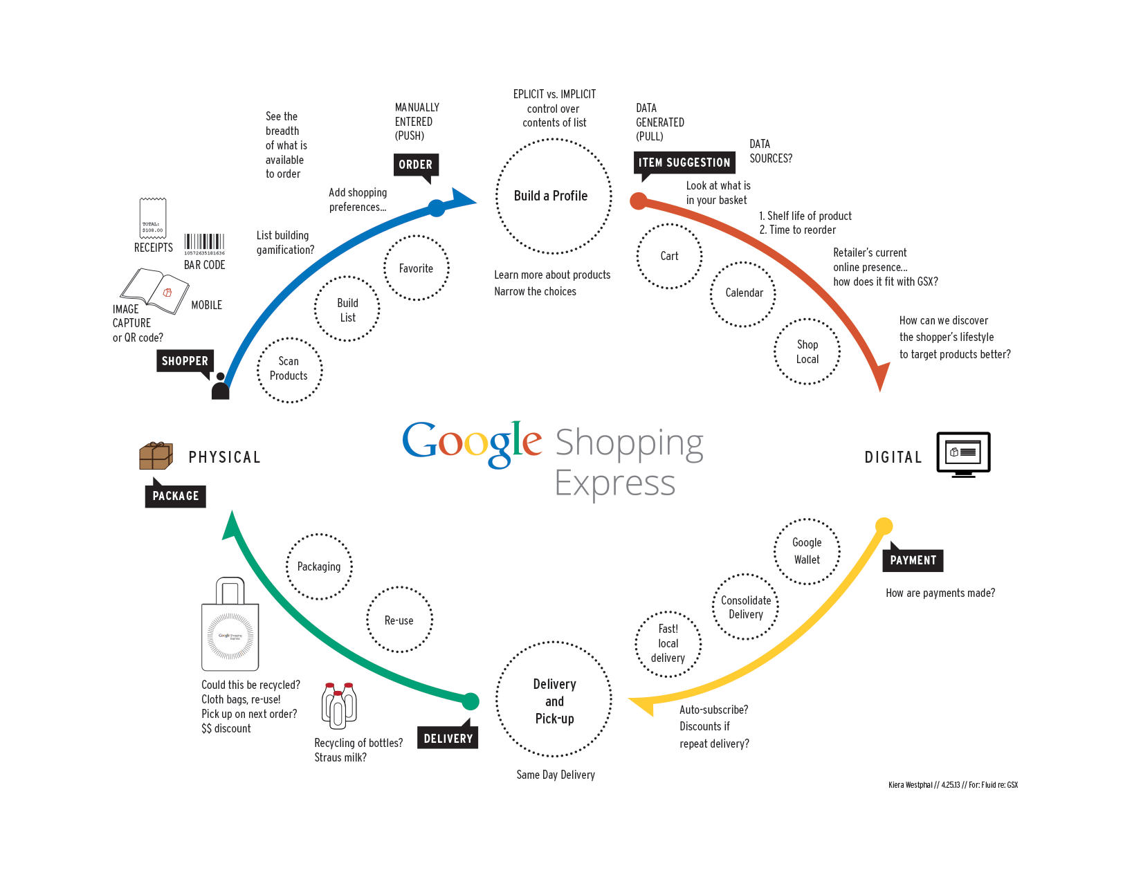
Mapping the whole experience
Google Shopping Express delivered products from local stores, often on the same day. Working with Fluid, I mapped how a shopper moves between the physical and digital parts of the service, from building a list to receiving the package. The map follows the shopper through four stages: order, item suggestion, payment, and delivery. It raised questions for the team, such as how to discover a shopper's lifestyle to better target products, and how payments are made. Google wanted a vision of the lifecycle as well as the screens that explain how the digital product worked.
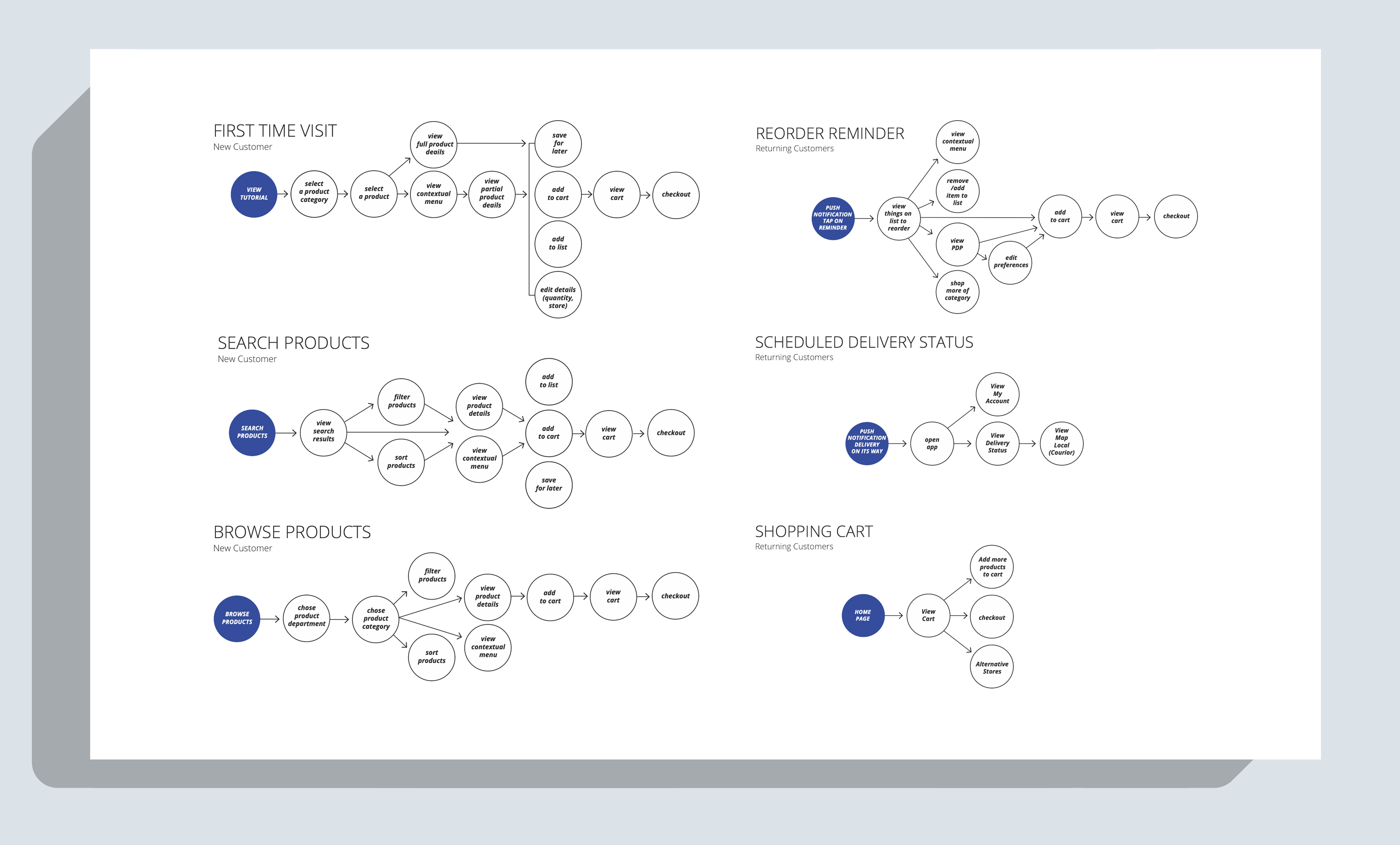
Designing for new and returning customers
My goal was a shopping app that made it quick to find, reorder, and track everyday essentials. How might we help shoppers get essentials delivered to their door with as few steps as possible? We made assumptions about these flows as we focused on giving Google a concept for in-app interactions.
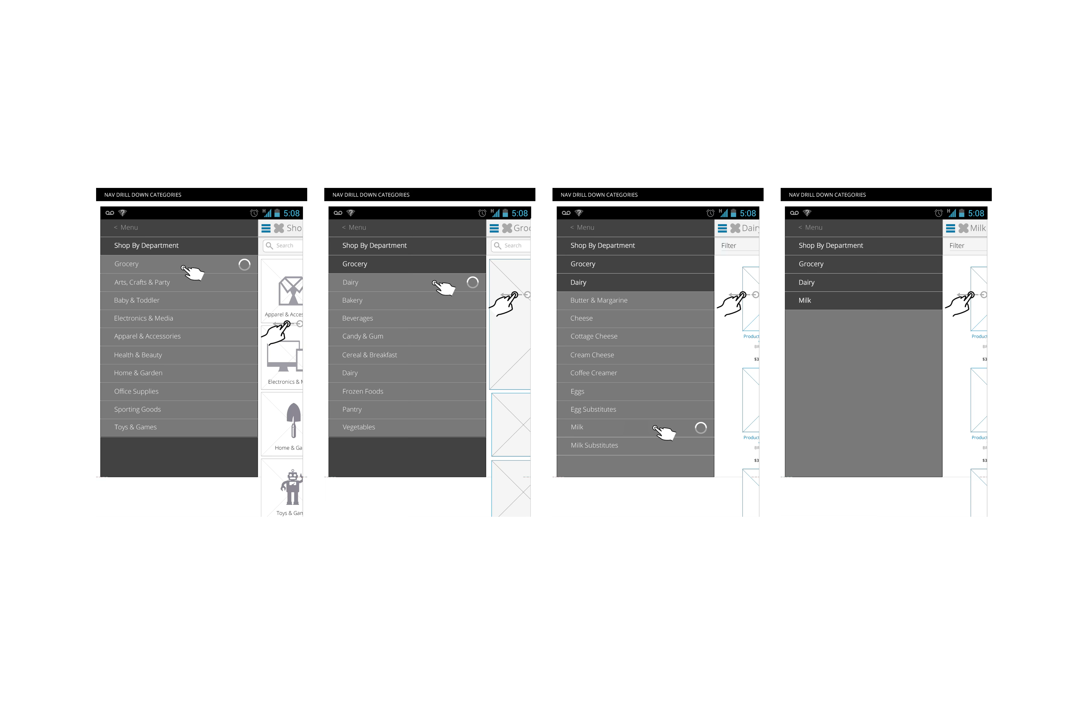
Drilling down to an item
Grocery shopping meant deep categories. A slide-out menu lets shoppers drill down by department, from Grocery to Dairy to Milk, while the products stay in view beside the menu.
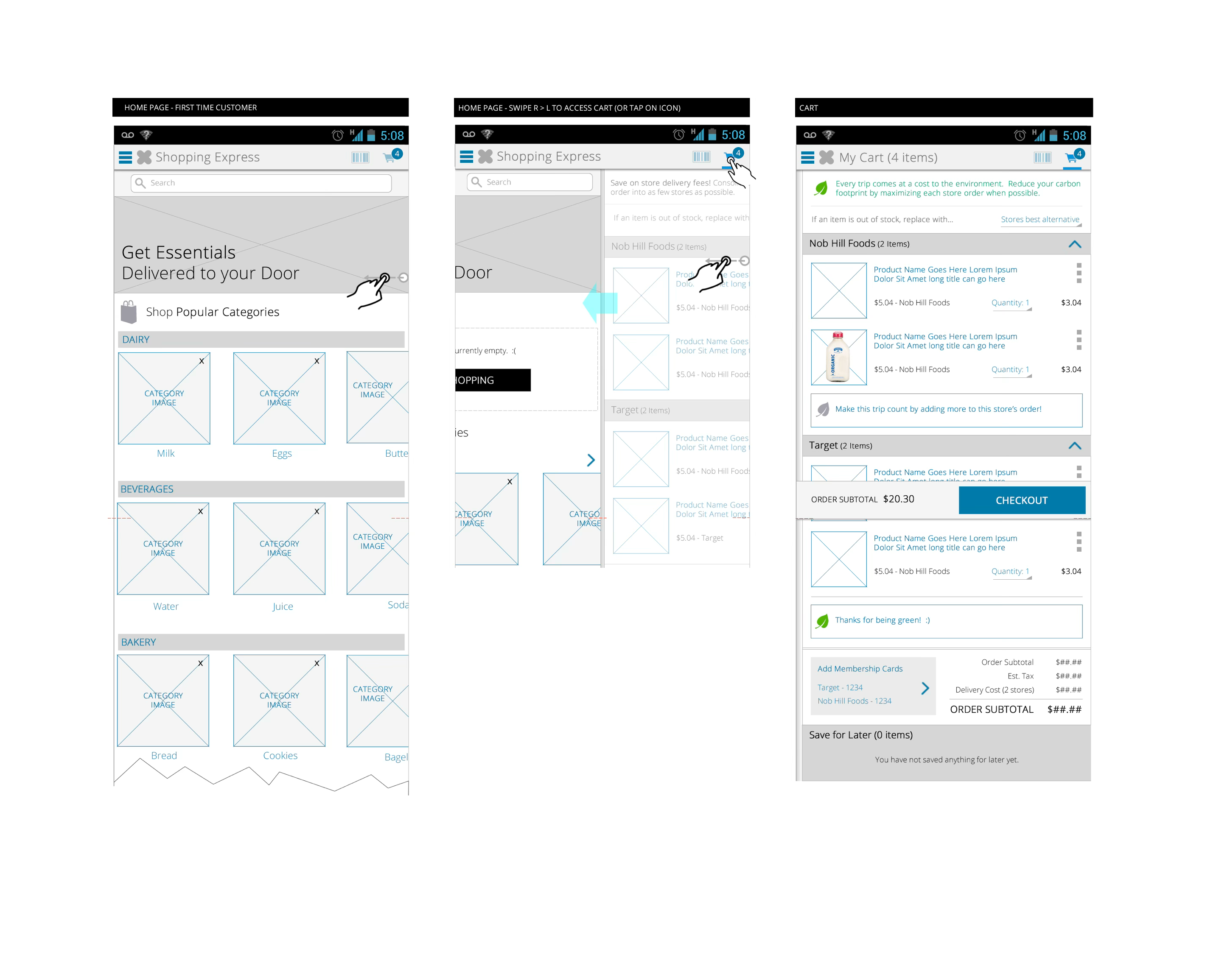
One cart, several stores
A single order could come from several stores, which made the cart the hardest screen to design. The team worked through how we would navigate the hierarchy, beginning with category. For example, drill down by department, from Grocery to Dairy to Milk. Items are grouped by store, such as Nob Hill Foods and Target, with quantity and price for each. We also encourage shoppers to consolidate deliveries to as few stores as possible to save on delivery fees and reduce environmental impact.
Results & outcomes
The work documented the product ecosystem and its touchpoints across desktop and mobile platforms. Google was pleased with the flows and wireframes.
Learnings
I enjoyed bringing service design to the Google Shopping Express platform to support the rebranding. As product costs skyrocketed on the platform, Google noticed declining engagement and decided to rebrand the entire service again.