3rst for Merchandise Mart Identity
A modular logo built from the letters of the name.
At a glance
- Company
3st, for Merchandise Mart Properties
May 2008
- Role
Logo Mark Design
- Team
Worked under the direction of Rick Valicenti.
- Responsibilities
Visual design, interaction design, concept design.
- Goal
Design the logo concept, color palette, block-theme variations, and an animated version of the mark for Merchandise Mart Properties
- Outcome
A concept presentation, color palette, variations on the block theme, and an animated "kinetic" version of the mark, presented to the client.
Merchandise Mart Properties was a vast building of showrooms and exhibition space that is constantly rearranged. Its modularity began the conceptualization of building an identity mark with block-themed variations and an animated version of the mark.
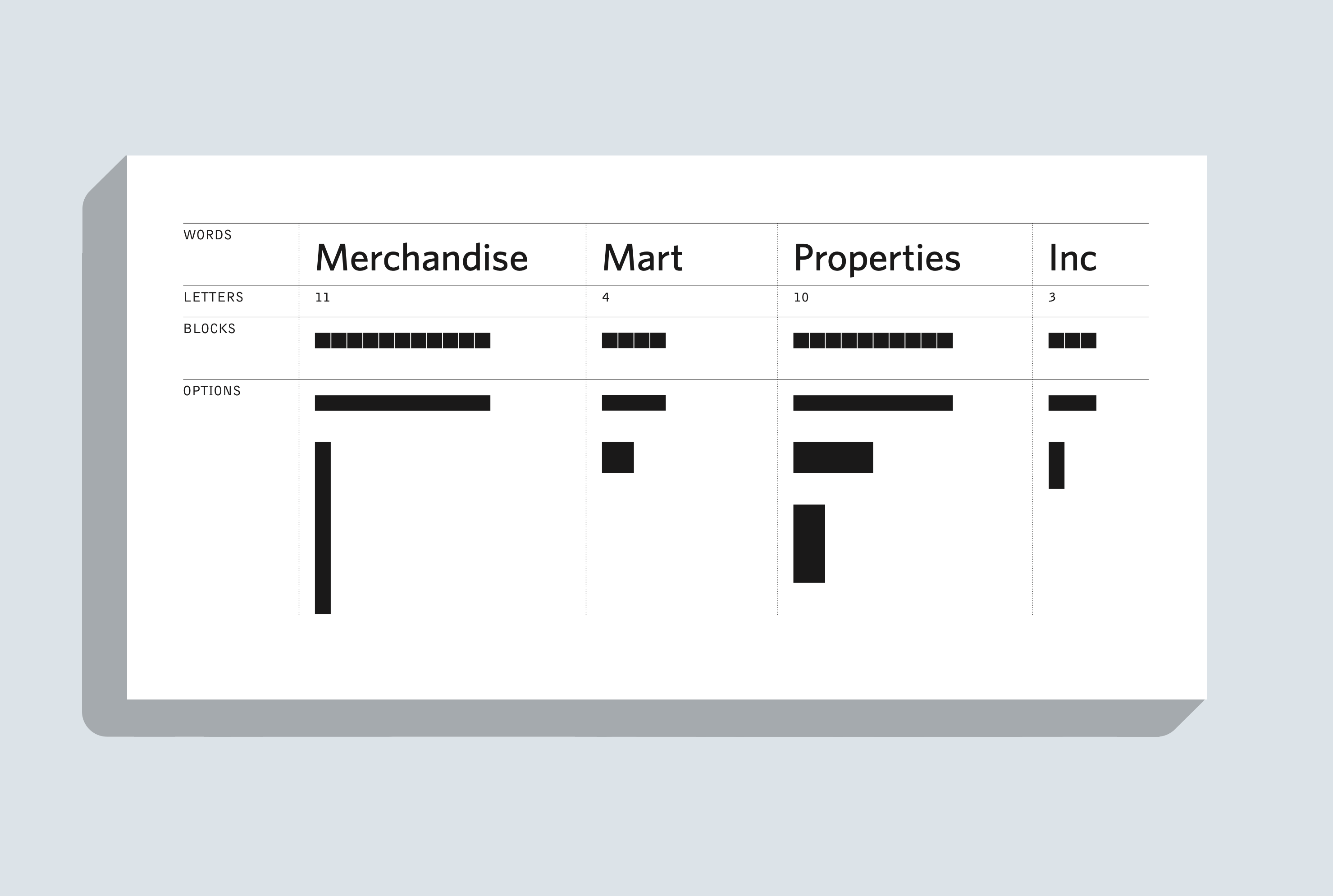
A mark for a modular space
Blocks represent the letters of the company name, so each word becomes a set of blocks of a matching length. This became a language of forms I began to work with. Could we build a kinetic identity to represent a modular space?
Blocks that rearrange
Making a mark that can change while staying recognizable constrains the creative process, leading to more possibilities. How might we build an identity that moves like a movable exhibition space?
A mark that evolves
I designed variations on the block theme in a color palette of blue, green, magenta, and black, one color for each word. Seen in three dimensions, the same four blocks form a family of marks, from solid stacks to thin, linear forms.
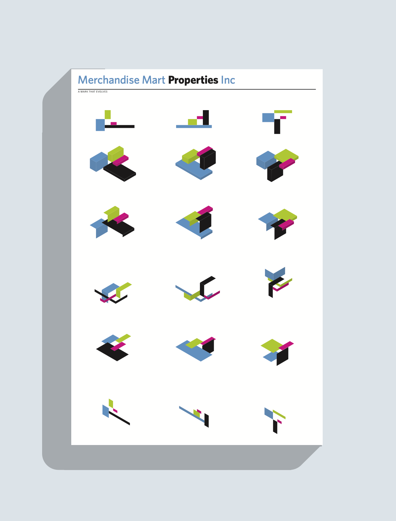
Bringing the marks to life
Putting the marks together in animation is the most compelling aspect of this concept. I created a kinetic version in which the blocks slide and stack into new forms.


Animation of Marks
This concept explored a graphic identity that would move. This reinforced the metaphor of the Merchandise Mart: a movable exhibition space.
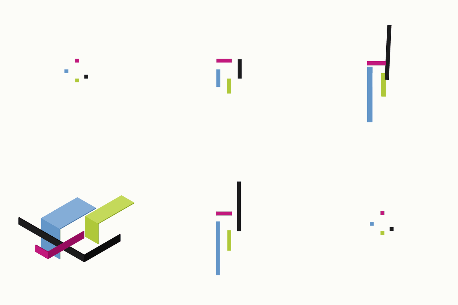
Presented to the client
We presented the concept, the color palette, the variations, and the kinetic mark to the client. In the end, they wanted something less dynamic and more understated, but exploring movable identity marks with Rick Valicenti was a career highlight.